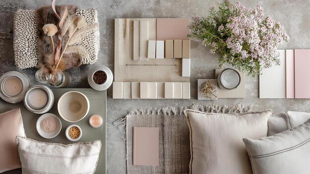
Mastering the art of room design depends entirely on how you balance your tones. Walking into a professionally designed home feels effortlessly cohesive because luxury designers rely on a proven spatial equation. To help you duplicate this flawless balance in your own home, our Interior Color Palette Generator uses classic design math to instantly curate a balanced color scheme for any room.
Here is how you can use the designer-approved 60-30-10 rule to transform your home with absolute confidence.
Interior color palette generator
Pick a room, a style and a mood. Get a palette that follows the 60-30-10 rule, with a quick room preview.
The 60-30-10 Rule Explained
The 60-30-10 rule is a timeless interior design guideline that ensures your colors look balanced, intentional, and visually resting. It breaks down your room’s color palette into three distinct percentages:
- 60% is your Dominant Color: This is the foundational anchor of the space. It creates the overall atmosphere and background. It is typically applied to large surface areas like your walls, largest area rugs, or major foundational furniture pieces.
- 30% is your Secondary Color: This tone supports the dominant color but provides enough contrast to keep the room interesting. It is used for mid-sized elements such as drapery, accent chairs, painted cabinetry, or a statement accent wall.
- 10% is your Accent Color: This is your pop of character. It draws the eye and gives the room a curated, high-end personality. It is applied sparingly through decorative accessories like throw pillows, artwork, lamps, and hardware finishes.
The Rule in Action: Room Examples
To visualize how our generator applies this math, look at how the 60-30-10 rule effortlessly creates harmony across different spaces:
The Living Room
- 60% Cream: Soft cream-colored walls and a large, plush ivory rug set a serene, airy backdrop.
- 30% Warm Walnut: Rich walnut wood flooring, a matching coffee table, and tailored tan leather accent chairs ground the space.
- 10% Emerald Green: Deep emerald velvet throw pillows and silk-shaded table lamps bring vibrant contrast to life.
The Primary Bedroom
- 60% Muted Sage: Calm sage green walls envelope the room in a tranquil, sleep-inducing ambiance.
- 30% Crisp Linen: Pure white luxury bedding, crisp window drapes, and an upholstered headboard clean up the lines.
- 10% Brushed Brass: Elegant brass sconces, metallic drawer pulls, and a thin frame around a statement mirror provide a warm sparkle.
The Dining Room
- 60% Charcoal Gray: Dramatic, deep charcoal walls establish a moody, intimate, and sophisticated environment for entertaining.
- 30% Natural Oak: A solid light oak dining table and matching woven cane chairs cut through the darkness with organic warmth.
- 10% Burgundy Wine: Rich burgundy dinnerware, a centerpiece floral arrangement, and curated canvas art add a luxurious punch.
By respecting these proportions, you can experiment with bold or neutral tones without ever making a space feel chaotic. Plug your favorite base color into our tool above to discover your home’s signature palette.